
**UPDATE 2 : Added DEAD or ALIVE/HEALTH indicators on the scoreboard.
***UPDATE 3 : Increased the transparency of the background.
Hi,
I wasn't comfortable with the design of the scoreboard and HUD.
So I designed a new scoreboard and HUD. Do you like it?
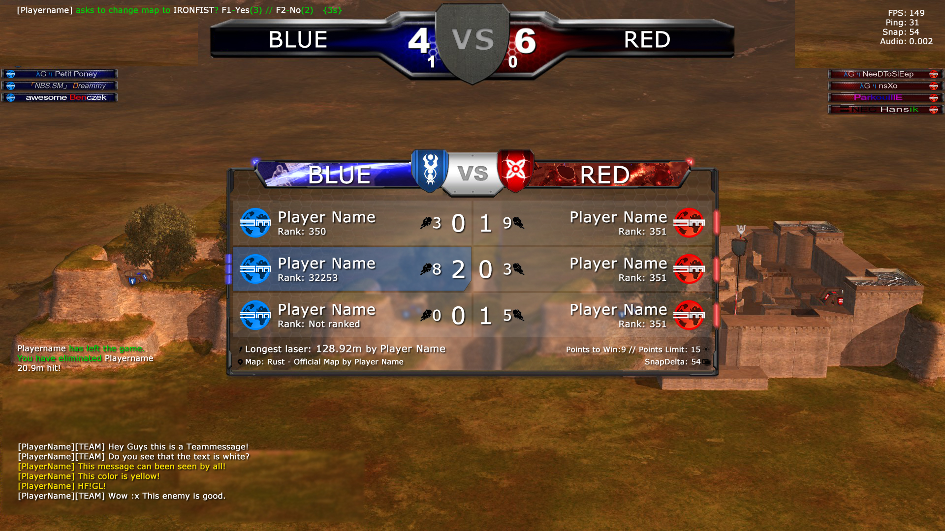
NEW : http://www.imgdumper.nl/uploads6/5117e3 ... eboard.jpg
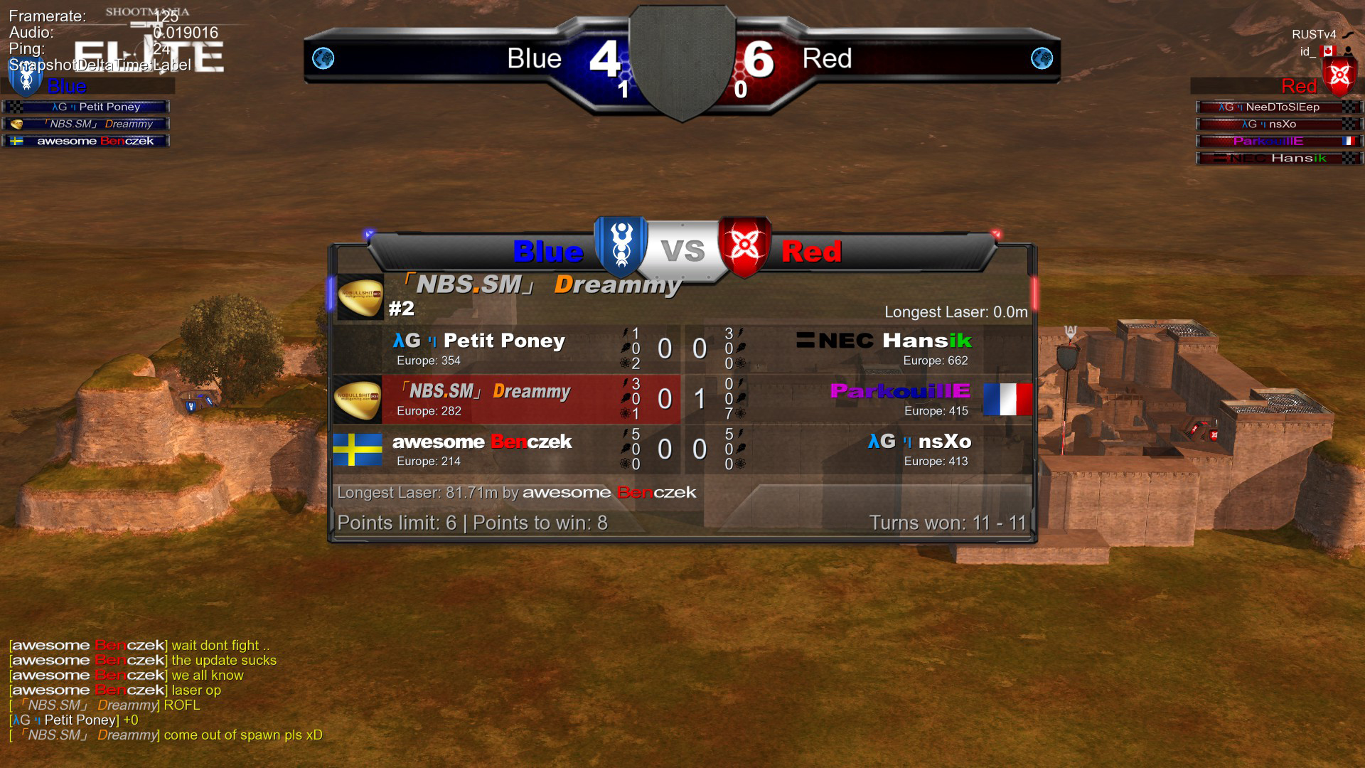
CURRENT NADEO : http://www.imgdumper.nl/uploads6/5116ee ... ardold.jpg
------------------
Changes from TOP to BOTTOM// LEFT to RIGHT:
VOTES:
-You can actually read the vote now, because I removed the storm logo & (FPS, PING,SNAP) was moved to the right.
SCOREBAR:
-Changed/Centered the text on the scorebar.
+Added "VS" on the shield on the score bar. The shield was empty first. ( needs improvement)
EXTRA INFORMATION:
-FPS, PING, SNAP & AUDIO was moved to the right + correct alignment.
This is now more readable because sometimes VOTES + The Storm logo would overlap.
Also I removed the mapname + creator and put it on the scoreboard instead.
PLAYERNAMES( left & right of the screen)
-Removed REDSHIELD+Text "Red" & Removed BLUEShield+Text "Blue" above playernames because this is OBVIOUS & can be seen on the scorebar.
- Every player has a default avatar. ( or your custom avatar/flag if you have one )
SCOREBOARD :
+Added images to the BLUE & RED team. ( needs improvement)
+Added DEAD or ALIVE/HEALTH Indicators. ( The lights next to your name )
--> no light = that player is dead.
--> The attacker has 3 lights. If he takes a hit 1 light will turn off.
-Correct alignment/centered of BLUE & RED team title.
-Changed text color of BLUE & RED team title to white.
-Removed the BIG ATTACKER NAME. ( read the next line )
-The player attacking gets a BLUE or RED background.
-Every player has a default avatar or flag or custom avatar.
-Increased fontsize of Playername & Scores. This is the most important.
-Decreased fontsize of "Points to win" & "Pointlimit"
-Increased fontsize of "Longest Laser"
+Added the MAPNAME + status ( official or custom ) + Mapcreator
+Added SnapDelta for convenience
+Added icons ( needs improvement)
NOTIFICATIONS :
-Nothing has changed
CHAT :
+Teamchat = white + [TEAM]-indicator
Chat = yellow
--> 100% more easy to read.
---------------------------------------
I honestly think this is better ( and it could be even better )
If you agree , then leave a comment with +1
If you dont agree, then leave a comment and tell us why & I'll see what I can do.
Who knows Nadeo might use some of our suggestions.


