luftisbollentm2 wrote:Looks nice and clean but after the name the old has 4 information statistics, but in your version it´s only 2 ?
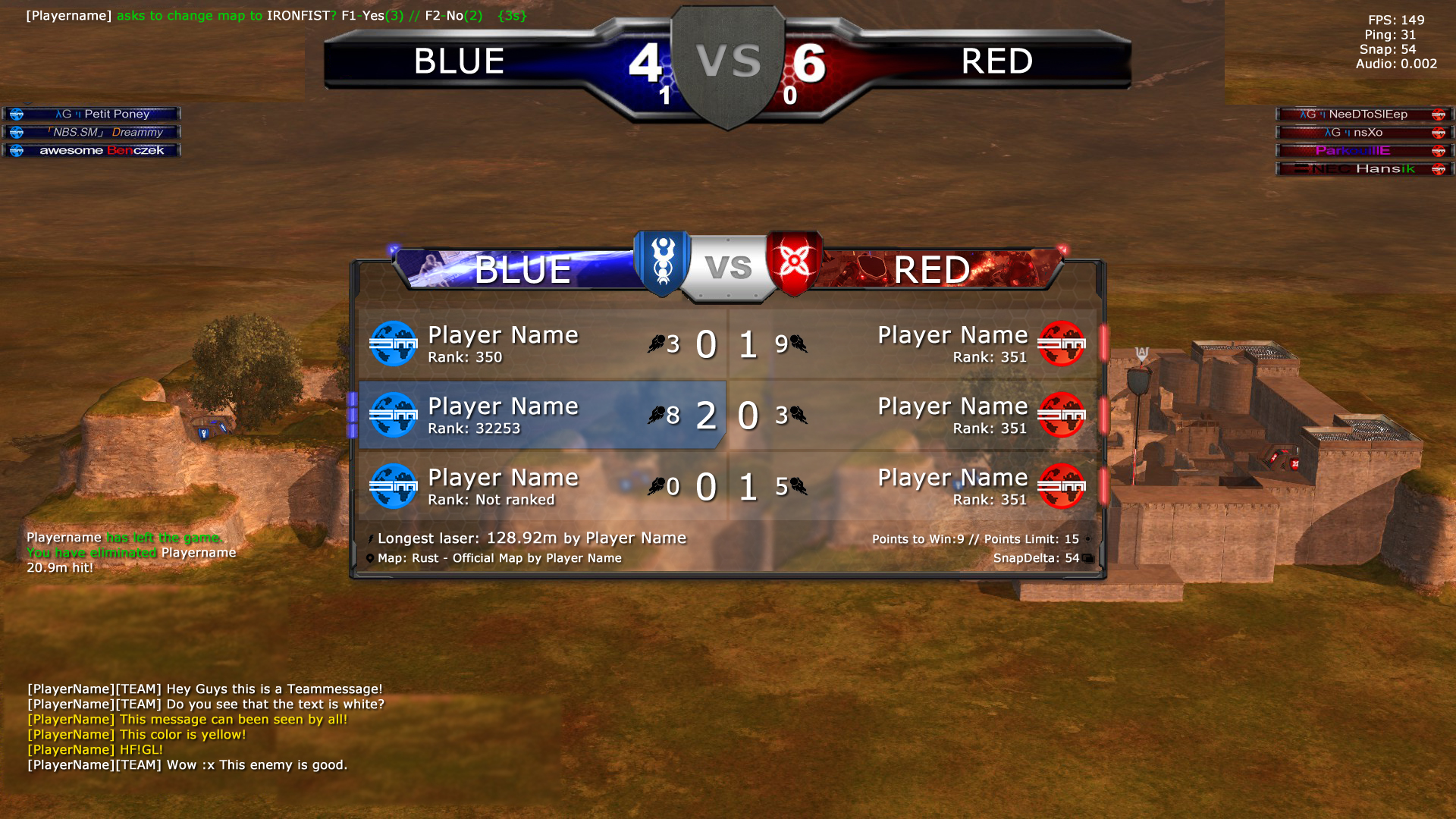
You mean the BETA3 gameplay. NADEO has removed this feature and now its back to 2. So my scoreboard is correct

luftisbollentm2 wrote:
and the map info is gone in your version so maybe you can add that under the top score board 4 - 6 like in my picture, a
Look closely
The mapname + creator is on the scoreboard.
Your example is not good, because its waaaaaaay too big and would have a bad impact on the gameplay.
luftisbollentm2 wrote:
And team message should be gellow not white
imo... maybe some shadow/edge on the text in chat to make it even more clear. And it should be the team name RAXOR vs INTOR Instead of RED vs BLUE, and team captain should always be on top

The chat yellow? Maybe you are right. Imo white is better. It reads better. ( that is just my opinion )
RAXOR vs INTOR is already possible. It is a serversetting. If you buy a server you can change BLUE/RED with whatever you like. However public it is always RED vs BLUE. The text is a variable, but I like that its bigger/centered/white now.
The teamcaptain can be on top yes. But you can do this yourself by pressing 1. ( ofc you would have to attack first^^ )
Thank you for your feedback. If you like it , tell ur friends and use the poll. Maybe NADEO will finally do something about the scoreboard.

