I've been here since 2012, so for more than 2years now the community is not happy with the design. ( And probably longer, but I wont talk about something I dont know for sure. )
So with almost évéry update we got a new scoreboard & small design changes. I can honestly say that after 5updates ( Ty NADEO )
the design still looks terrible... Better, but still terrible. The only almost good-looking thing is the store & homepage.
So we have these awesome screenshots here made by "kids", not even "fully educated". They arent professionals at all... but somehow they can design better than a professional gaming studio? Litterally every single screenshot in this entire thread is better than MP2 & MP3.
It took you guys a year to update MP2 to MP3... and we got all these new features, ( again Ty NADEO) but I would have prefered to wait 1year+1month and get a decent design.
Clearly whoever is in control of the design has a bad judgement/taste... The design needs to be redone asap & made 2014-worthy. This bad design is costing you money/customers. Seriously.
SUGGESTIONS:
killaprodtm wrote:
Sexy

Lovely

Awesome

Beautiful

Minimal, but sexy
http://www.noelshack.com/2014-28-140474 ... rtwork.jpg
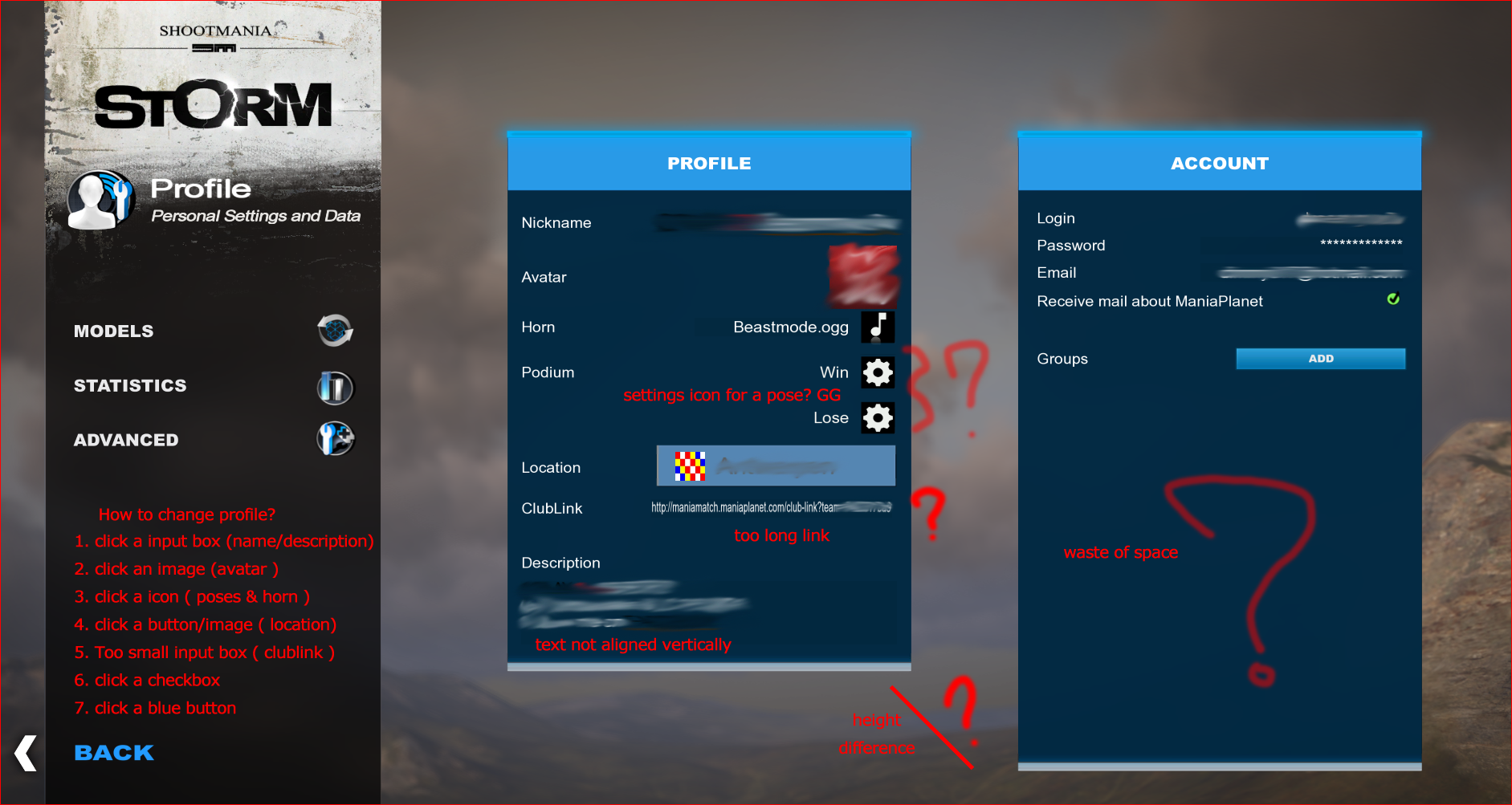
CURRENT NADEO PROFILE PAGE
Terrible
http://www.imgdumper.nl/uploads8/53fc8d ... lerage.png
This profile page is the perfect example.
Every single thing you wanna adjust just feels weird. You have absolutely no idea whats gonna happen when you click something. I need to click (different sized, WHY????? ) textboxes, checkboxes, settingwheel-icons for a pose(why????), a blue button, an image, a location-button ( in again a different style )...
Nothing is aligned, centered, logical, properly-scaled. Absolutely nothing. The most random page in ManiaPlanet.
Im not trying to be rude at all. Again, this is the simple truth.
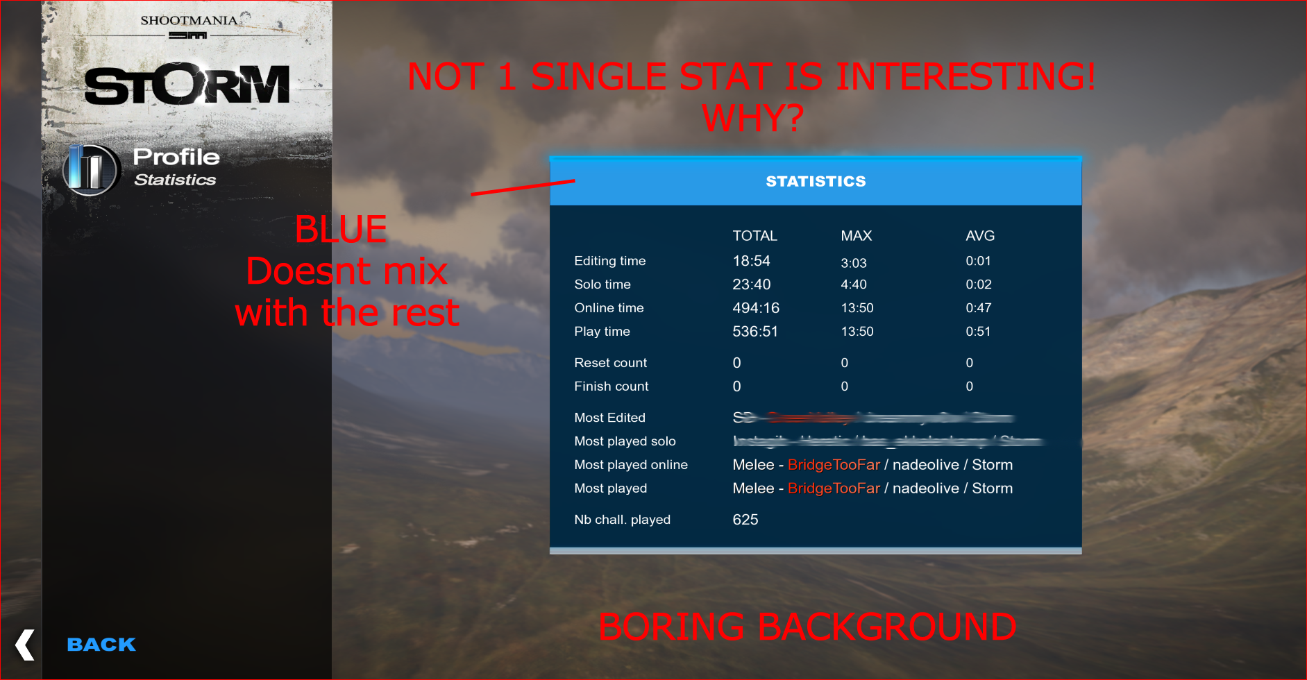
CURRENT NADEO STATS
http://www.imgdumper.nl/uploads8/53fc8f ... smyass.png
Look at this page please, everybody & NADEO. It feels like 1 big troll. No further comment.
Do I really need to come here on the forums to tell you guys how to center a text? Ill create a video-tutorial if you guys want me to.
Clearly something is fundamentally wrong in your workflow if you need to redesign the scoreboard 5x, so open your eyes & redesign your work. Where is your dignity? Where is your honor?

Is this really the best you can do?
Who's idea was it to add new stuff, when clearly sooooo much isnt finished?
Do you guys have a clear direction? How will this game look in 2015? Dont you guys have a final design? Do you guys even have a final design? If you would, then redesigning the scoreboard wouldnt take 2years...
And Hylis, you will probably think I was RUDE & NOT-CONSTRUCTIVE again, but I post this here because I care & because I love the game. I want the game to be good.
You can reply ( or not ) and say that for every person that hates your design, you can find 1 person that loves it.
You can say that other games are already 28years in developement and that ShootMania has just been released in 2013... Well for me thats not good enough...
Keep the game small, but PERFECT. People will see this & they will see the potential. They will believe in the future of your project ( MP ). All we get is new & new & new unfinished stuff on top of old unfinished stuff... People lose faith & leave. Cleary this is a LONG-TERM project... So give us something to stay. Every update is half finished. Thats NOT the way to do it. Give us quality updates every 3months. Every update needs to be a step forward & should feel finished. The problem is that MP was bad from the beginning and people leave & leave & leave...
I can honestly tell you that ALL players I have played with ( 50+ , 100+) dont like the design. Join cplay/paragon ts and ask all members there and you'll be surprized with what they will tell you. You are officially invited.
We also have a FB-group with 500 ShootMania players. Start a topic there and ask what we think about the design. I dare you

I give the current design 2.5 / 10 and thats generous & im really dissapointed.
I also hope a NADEO employee wont reply : "if you dont like it, then leave" because yeah... u know, that happened before.
EDIT:
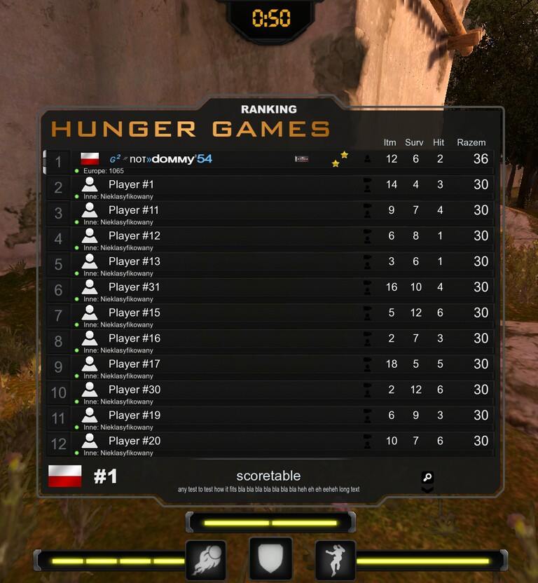
Hunger Games title.
16y old domino is working hard on the design. Already looks better than any other scoreboard out there. And he confirmed he made this in PAINT. Paint ahahaha
http://www.imgdumper.nl/uploads8/53fc99 ... eboard.jpgThe neverending waiting game has to stop.


